Make nice high-res charts and graphs

Curious software engineer
I found it frustrating when using graphs from Google Drawings into Google Slides that the final render of the graphs is always low resolution. That is why I searched for a way to improve that, and I knew SVG would be the direction to look at. Here is the solution I found.
What you need?
- LibreOffice https://www.libreoffice.org/ (It may also work with OpenOffice)
- Inkscape https://inkscape.org/
- A chart or a graph you want to export in high resolution
- 5-10 minutes
Nothing could be simpler...
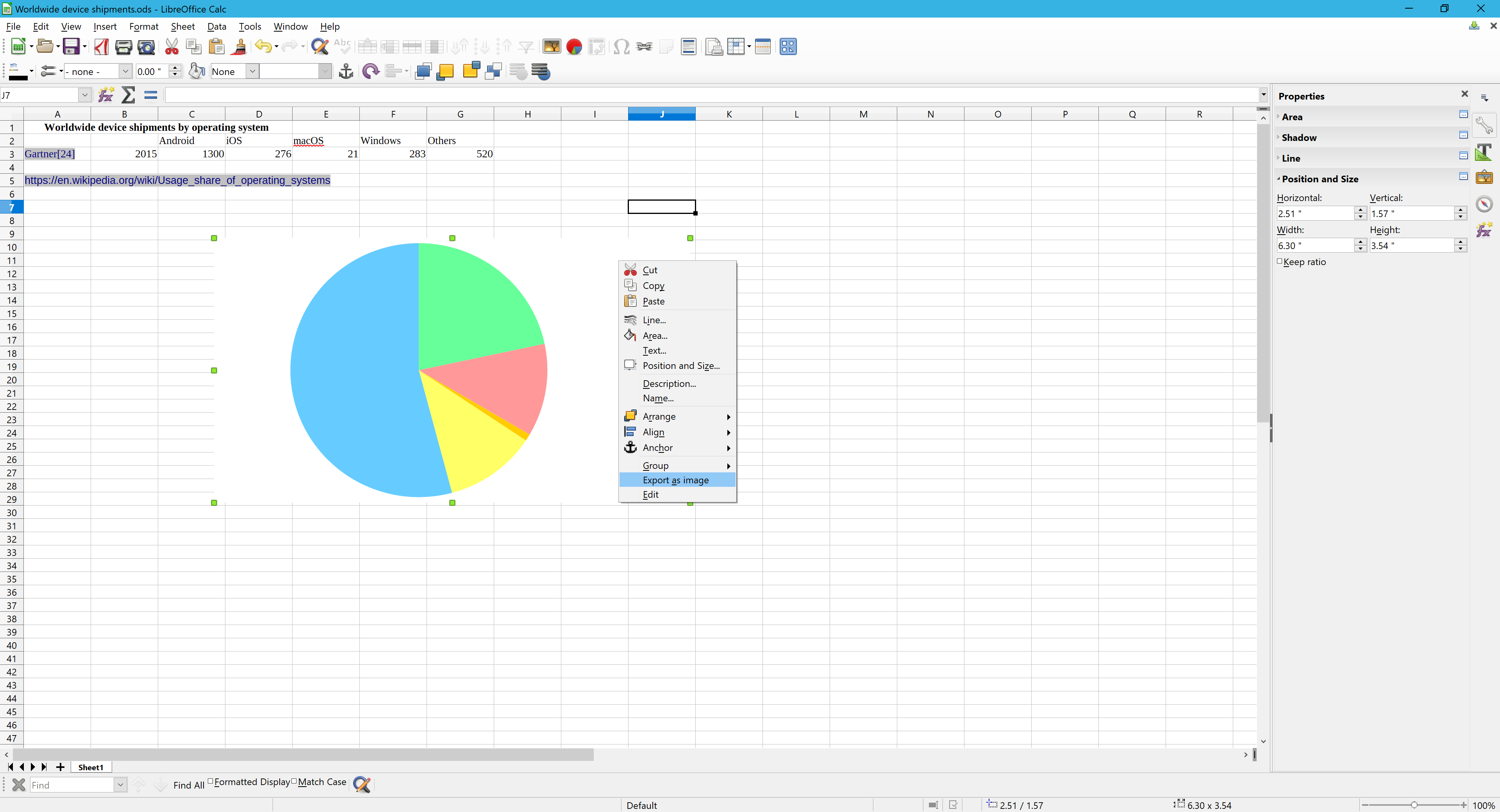
First, if you are not working with LibreOffice yet, then download it right away. After, start LibreOffice Calc, import your data and generate the chart you like.
Once your chart is ready, right-click on it and select: Export as image, as displayed in the picture below.
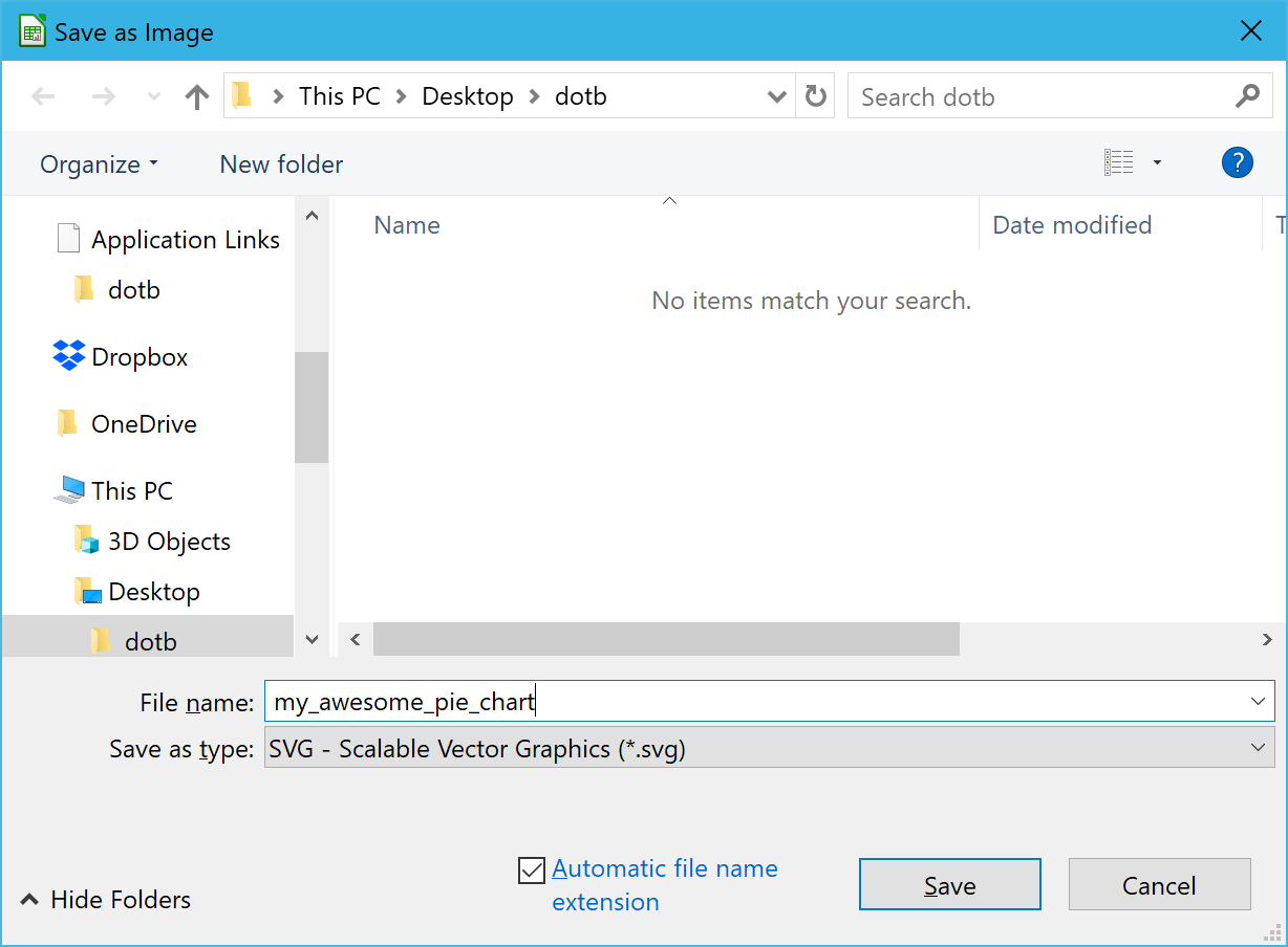
You will then be invited to select where and how to save your image. The idea is to take profit of the vector format, so we are going to save our image as an SVG file.
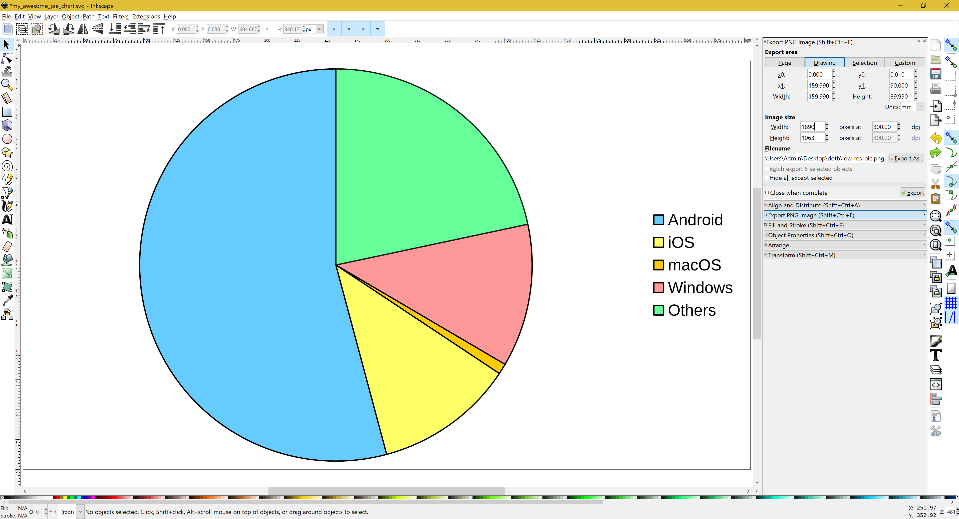
Once saved, open the SVG file into Inkscape and you should see something like below.
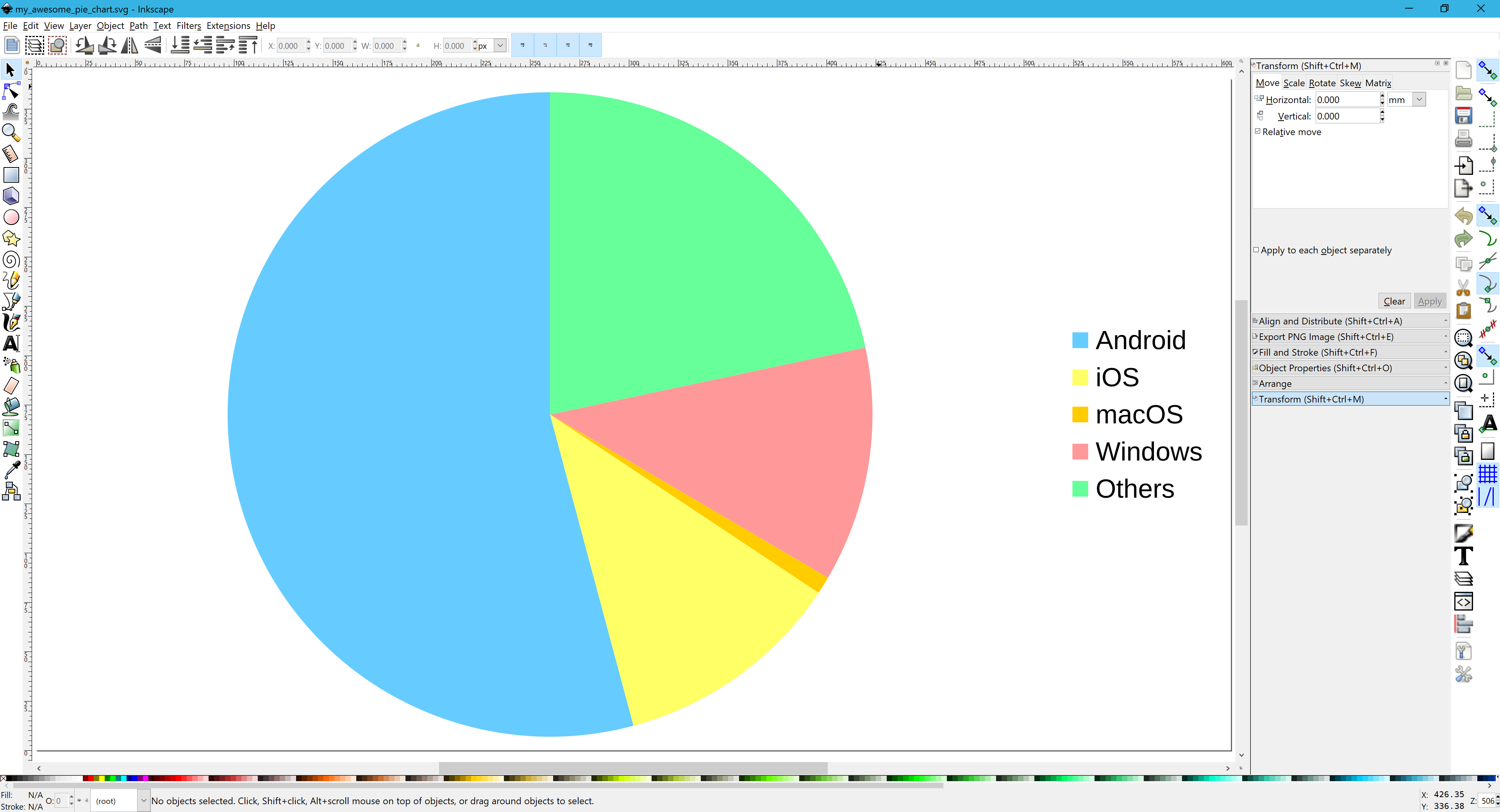
Here you can still edit the picture as you want actually. If you changed your mind and wants to change your colors scheme or resize some elements. Everything is possible. For example here I just added outlines to the pie and its slices.
Then you can export in PNG in high resolution so that you make sure you don't lose quality like in the screenshot below.
Rasterized exports
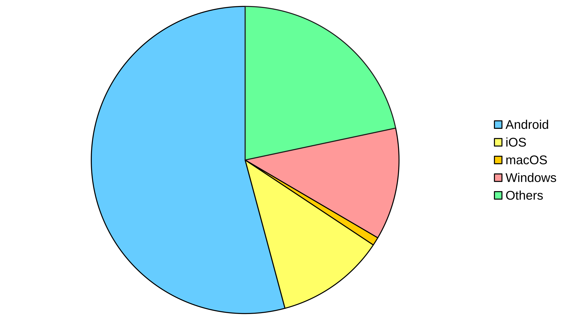
High Resolution: 300 DPI, Weight: 102 KB
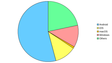
Low Resolution: 60 DPI, Weight: 13.5 KB
Vector exports
And after all if your communication support allows SVG files (unlike Google Presentation), we recommend you to just save a copy as Plain SVG and display the SVG directly. FYI every modern browser support SVG (https://caniuse.com/#feat=svg).

Plain SVG edited in Inkscape, Weight: 30.4 KB

Plain SVG from LibreOffice, Weight: 3.64 KB